Web · Development · UX · Mobile
Website for Argument law firm
A site from scratch for a law firm: sticky header with booking, modal forms, services for companies and individuals, trust on the homepage, and a solid phone experience.
About the client
Argument is a Voronezh law firm: retainer support for companies and help for individuals. We previously promoted them in search (separate SEO case); here — a new services site where booking a consult is easy.
The pain they came with
Legal services sell on trust and clarity. If finding a service, calling, or leaving a request is hard, the client goes to whoever makes it simpler. They needed a working booking channel, not a brochure site — within a sensible budget.
-
Services drown in the menu
Lawyers have many practice areas — for business and for private clients. Without structure, visitors don’t know where to click and give up.
-
Request buried
Phone and booking must stay at hand. If the form is deep below or on another page, fewer people call.
-
Awkward on phone
Some clients look up a lawyer on a phone after an accident or dispute. The site must read well and offer one-tap call.
How we guided them
We locked the goal — book a consultation — and built the site around it: header with contacts → trust on the homepage → services catalog → distraction-free forms → tablet and smartphone checks.
- 01
Built a sticky header: address, phone, book a visit, and request a call
- 02
Moved secondary pages into a dropdown so the UI stays light
- 03
On the homepage — case stats and resolved conflicts + team photos
- 04
Split Services into companies and individuals, then by category
- 05
Made forms modal with a dimmed overlay and privacy consent
- 06
Added click-to-call and checked Mobile Friendly on tablets and phones
- 07
A separate page for partner discount bonuses
In plain speak
Brief jargon — without the fog. How we explained each step to the client.
Sticky header
The header with phone and “book” / “request a call” stays on screen while scrolling — no need to scroll back up to contact them.
Modal forms with overlay
When requesting, the rest of the site dims: nothing distracts; the person fills name and phone and sends.
Mobile Friendly + click-to-call
On a phone the site reads fine, and the number is one tap to call — no copying digits.
What we did, step by step
Each step is a concrete change. Meaning on the left, screen on the right.
Header as the entry point
Address, phone, and two booking buttons always visible. Secondary links live in a dropdown. Navigation stays simple; the UI isn’t overloaded with links.
Trust on the homepage
A block with positive decisions and resolved conflicts, popular services, and lawyer photos — so it’s clear right away: a living firm with practice.
Services for companies and individuals
Services split: companies (retainer support, reorganization, antitrust, and more) and individuals. Inside — categories so people find the right practice faster.
Mobile path
Checked tablets and phones: forms, menu, and services stay usable. Click-to-call on the number — a simple thing often forgotten, critical for lawyers.
More frames from the project
Not a gallery for its own sake — a few screens that complete the picture.
Where we landed
A functional site without extras: clear navigation, requests and calls in view, equally usable on desktop and phone. Still live on argument-uk.ru.
What they got
- Services site from scratch within a sensible budget
- Sticky header with booking and call request
- Modal forms + personal-data consent
- Services split for companies and individuals
- Trust: stats and team on the homepage
- Mobile Friendly and click-to-call
- Separate partner discounts page
In numbers
Need a site for a professional services firm?
We’ll build a clear structure, booking forms, and a mobile path — the same way we did for Argument.
Other projects
Similar cases and neighbouring directions
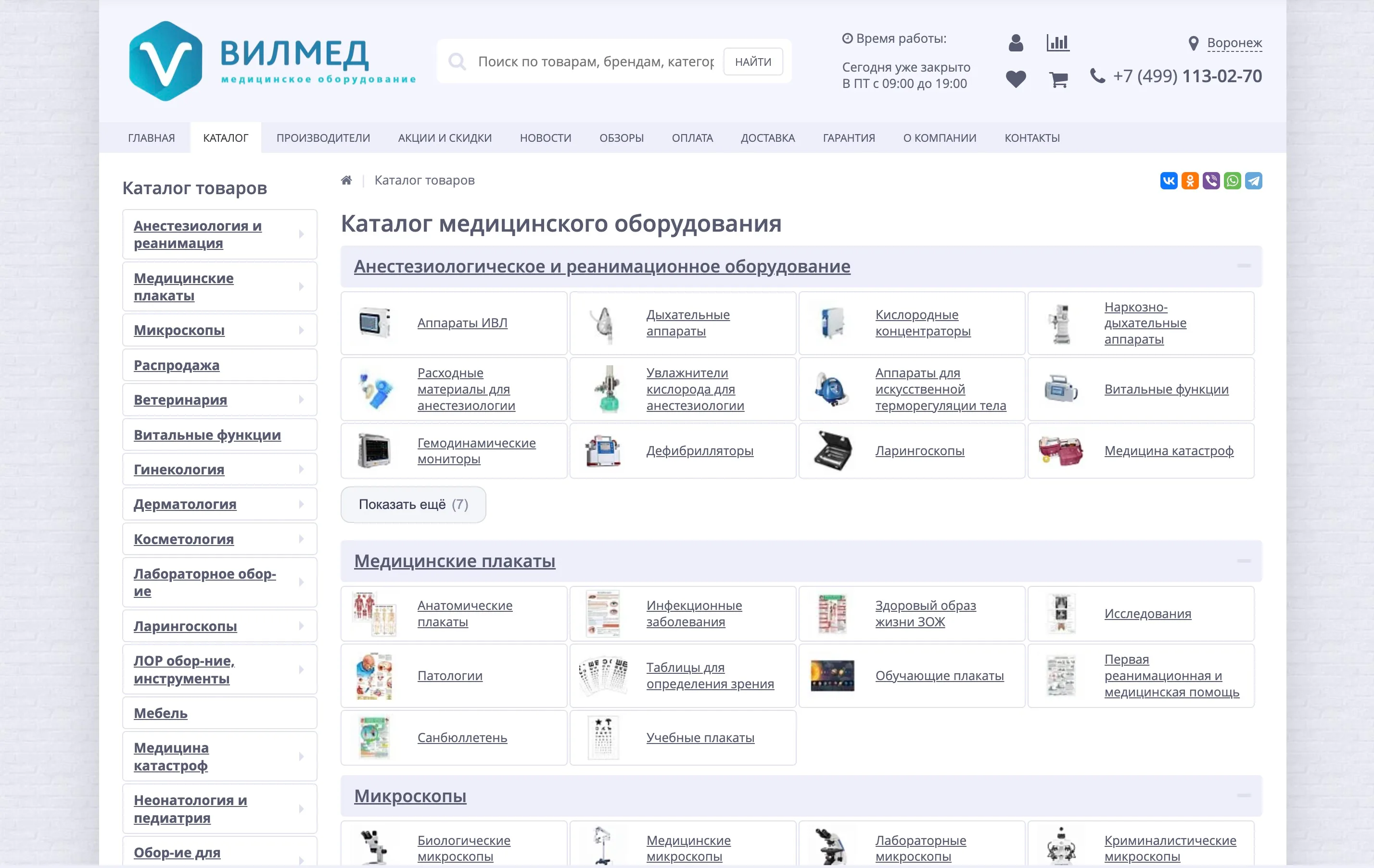
15,000+ products in catalog
VILMED
VILMED storefront improvements
Ongoing work on a large medical-equipment store on Bitrix: sticky header and smart search, catalog and product-card UX, SEO filters, ERP sync, composite/Brotli, and a shell cleanup. Live at vilmed.ru.
View case →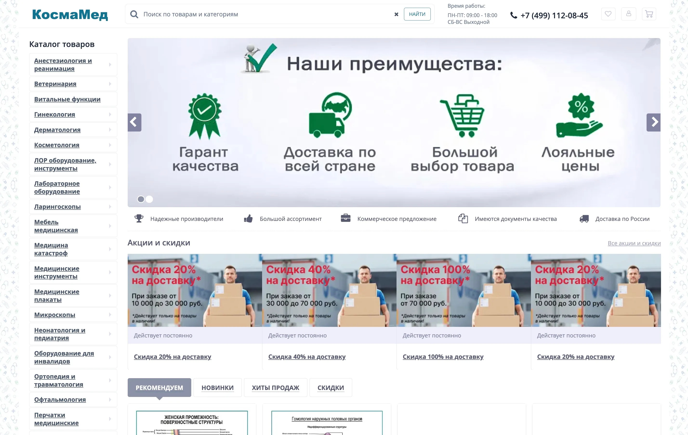
55,000+ SKUs in the catalog
KosmaMed (formerly MedMarket)
KosmaMed online store
We run a large medical-equipment store on Bitrix: MedMarket→KosmaMed rebrand, domain migration with 301s, speed (no RAND, composite, WebP), MoySklad/ERP/carriers. Live at kosmamed.ru.
View case →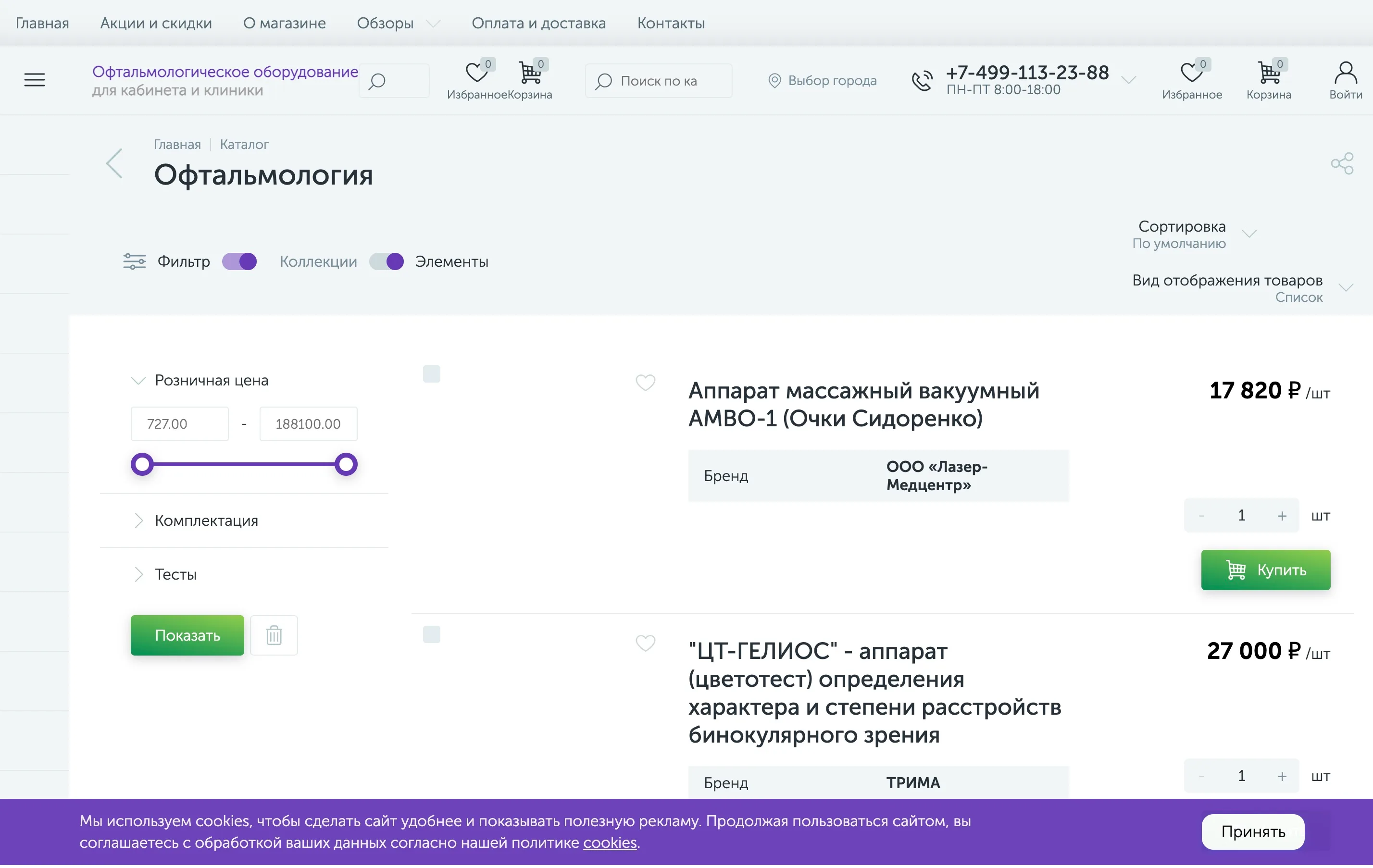
~1,900 SKUs in the catalog
Oftalmag
Oftalmag online store
We run an ophthalmology-equipment store on Bitrix (enext): Heine/KaWe/Riester catalog, “request a price”, city picker, account SEF. Live at oftalmag.ru.
View case →