New format
Instagram templates: a unified feed and post style
An Instagram template is a preset visual frame: size, margins, fonts, color palette. The feed looks coherent, and each post isn’t built from scratch.
Below: why mockups help, grid layout schemes, and how to build a template on desktop and phone. App UIs change — a consistent style matters more than button screenshots.
Why templates
A unified style boosts recognition and cuts time per post: filter, margins, and font are already chosen. New visitors grasp what the account is about faster.
A grid mockup (feed preview) helps you keep the composition intact: color alternation, collage, rows — planned, not whatever happens.
What a template system gives you:
- less time per design
- a predictable profile grid
- less font and color chaos
- easier to delegate — “drop the photo into this mockup”
Feed layout schemes
A 3×N grid reads downward in rows of three. A sharp style change every three posts hurts recognition — evolve gradually rather than looking like a different brand every week.
Popular schemes:
- basic — one palette and preset on every frame
- checkerboard — alternating light/dark or photo/text cards
- rows or columns — meaning blocks of three
- orientation contrast — carefully: the feed still crops in preview
- multi-post collage — rarely, and only if you can finish the series
How to build a template
On desktop: Canva, Figma, Photoshop, or similar. Set size for the current post format (square / vertical — check the platform’s current guidance), safe margins, 1–2 fonts, a color pair, space for photo and short text.
On phone: the same Canva / Lightroom presets / template editors. Save a brand kit: colors and fonts not “from scratch” each time.
Grid preview: apps like Preview and peers let you rearrange drafts before publish — handy to check checkerboards and rows.
Lock in the template:
- canvas size
- margins and text zones
- palette (2–3 colors)
- headline and body fonts
- color/grain preset
- CTA button/badge style, if any
Tools and ready mockups
Canva and peers — a fast start with an “Instagram post” catalog. Creative Market and paid template packs — check the license. Mobile editors (VSCO, Snapseed, PixelLab, etc.) — for finishing a frame, not instead of brand logic.
App names and plans change (old guides with Adobe Spark / Crello read as brand history). Pick what exports without a watermark and stores your brand kit.
Before publish:
- text reads in preview
- faces and prices aren’t cropped
- a grid of the last 9 posts looks coherent
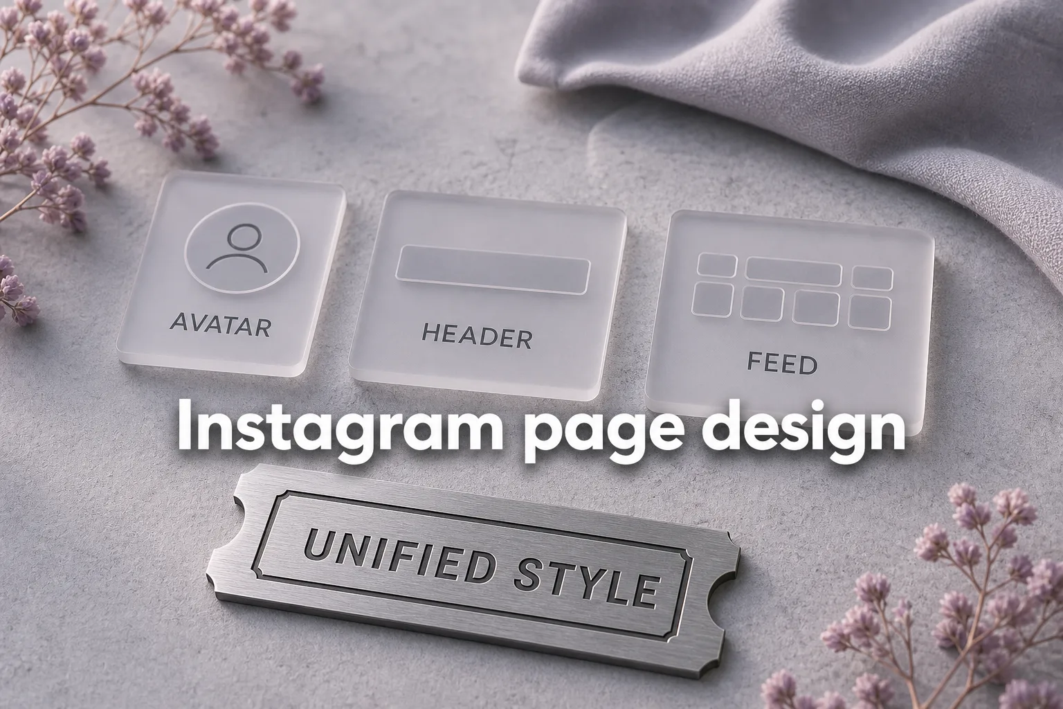
- the template doesn’t clash with the avatar and highlights
FAQ
How is a template different from profile design?
Design is the header image, avatar, bio, and overall tone. A template is a reusable post/Stories frame and grid planning. See also the profile design article.
Is a checkerboard grid required?
No. It’s one technique among many. For many brands, one palette and recognizable fonts matter more than strict geometry.
Is Canva enough for Instagram templates?
For most tasks, yes: brand kit, post/Stories sizes, export. Use Photoshop if you need fine layer control.
Do I need a separate Stories template?
Yes, if you often make highlight covers and Stories series. Same logic: consistent style and readability.
Does a template replace a content plan?
No. The mockup speeds up design; what to publish and why lives in the content plan.
Feed looks messy and every post starts from scratch?
We’ll lock a brand kit and post templates so the grid stays coherent.
Discuss the task