New format
Website homepage: attract attention without confusing people
The homepage is the entry point: in seconds people should know where they landed, what value they get, and what to click next. Beauty without clarity annoys as much as an outdated look.
Below: a frame for a corporate/services site. A separate storefront breakdown is in the e‑commerce homepage piece; which phrases not to put on the homepage — in the homepage-copy article.
What people must grasp immediately
Who you are and for whom. What you sell or which problem you solve. How you differ from lookalikes. What to do next (call, form, catalog).
Wherever traffic came from, some people click the logo and land on the homepage — it should assemble the site’s meaning.
Minimum on the first screen:
- the offer in plain words
- a visible CTA
- navigation to key sections
- a contact or messenger
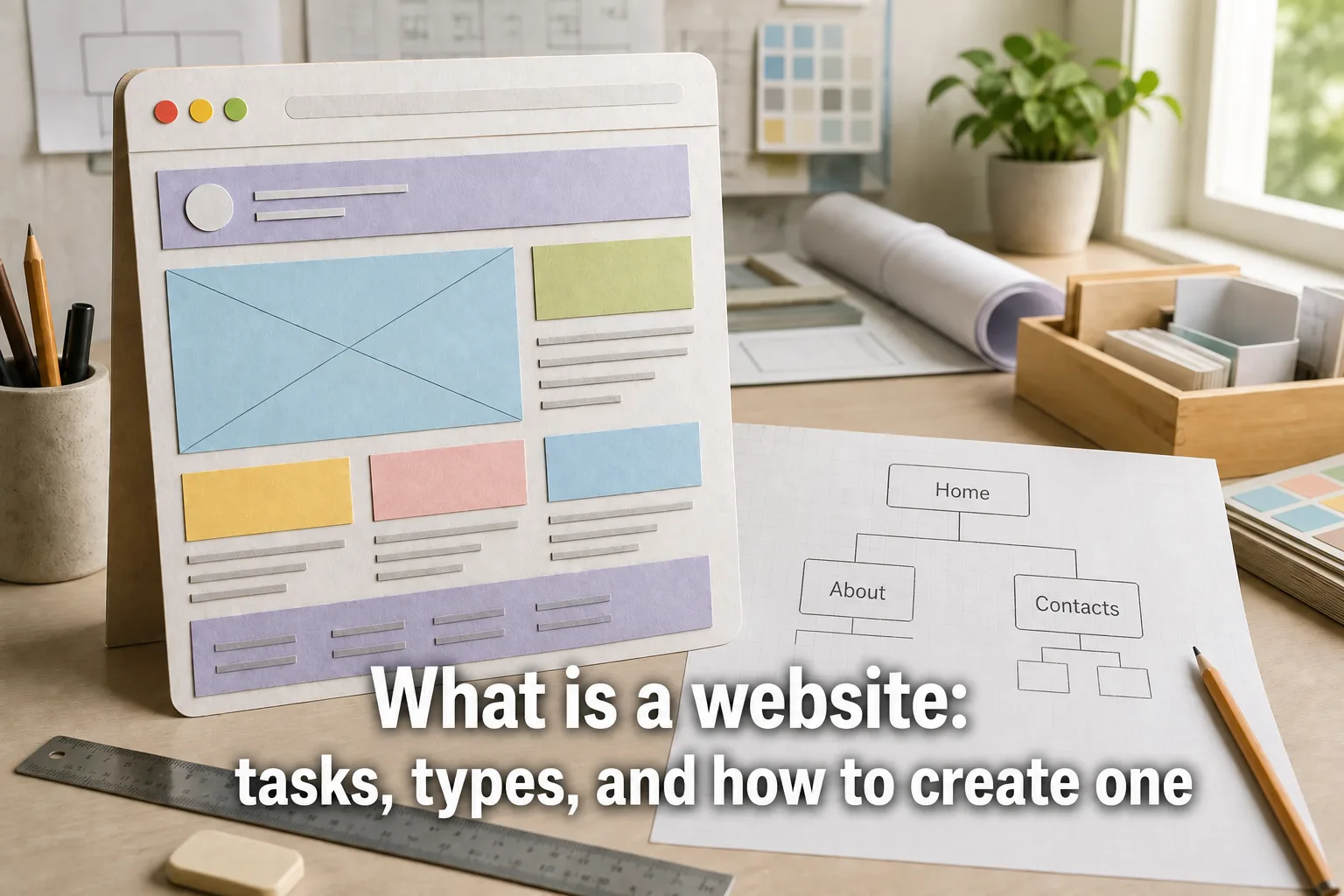
Block frame
Header: logo (to home), menu, phone/contact. Don’t invent exotic unlabeled navigation.
Content blocks: services/directions, proof (figures, cases, reviews — no fakes), benefits.
CTA: one primary goal per screen; secondary links stay quieter.
Footer: site map, legal block, contacts, sometimes a form — see a separate piece.
What to keep in mind while designing
Walls of “about everything” kill scanning. Cut.
Offers and promos should be visible — without blinking chaos.
Images — yours or licensed; decorative filler art isn’t required.
Benefits in moderation: three strong ones beat ten clichés.
Update season and offer; a dead homepage erodes trust.
SEO on the homepage without overload
Unique title and description for the brand/main intent.
One H1 with the company’s meaning — not a keyword dump.
Internal links to money sections.
Don’t turn the homepage into a dump of the whole keyword core.
Key takeaways
The homepage explains and leads on — it doesn’t tell the whole biography.
Header, offer, proof, CTA, footer — a sufficient frame.
For a store, see the separate showcase guide.
FAQ
Is the homepage the whole site?
No. It introduces and directs. Services, cases, pricing, blog — on their own URLs, or you get a wall of text.
How much copy does the homepage need?
Keep it short: offer, 3–5 benefits, trust, CTA. Details belong on inner pages.
Is a slider required?
No. It often hurts. One strong first screen with an offer and a button beats a carousel of ten banners.
Where do phone and CTA go?
In the header and/or first screen — visible on mobile. A footer duplicate is fine.
Does SEO matter on the homepage?
Brand, navigation, internal links. Don’t dump the whole commercial keyword core here — landings matter more for many queries.
How often should it update?
When the offer, season, or promos change. A “live” homepage beats a forever 2015 stub.
How is it different from a store homepage?
A shop leans harder on showcase, search, categories, and cart. Services/B2B — offer, proof, path to a lead.
Does “company history” belong on the first screen?
Usually no. A short meaning — yes; the founder’s biography — in About.
Pretty homepage, but the offer and CTA don’t read in five seconds?
We’ll rebuild the first screen and block frame — clarity first, slider last.
Discuss the task